Designing App Icons for Dark Mode: Tips, Tricks, and AI Shortcuts
Dark mode is no longer a niche feature—it’s the default for millions of users across iOS, Android, and desktop.
But here's the problem: many app icons disappear or look dull in dark mode. If your icon fades into the background or loses clarity, users may scroll right past you.
Let’s fix that. Here’s how to design app icons that shine in the dark—plus how our AI Icon Generator helps you do it in seconds.
🌒 Why Dark Mode Design Matters
Over 80% of mobile users use dark mode at least part of the time. That means:
- Your icon might be shown on near-black backgrounds
- Low-contrast or overly dark icons will get lost
- Some color combos that work in light mode don’t translate well
If your app icon doesn’t stand out against black or charcoal… it’s time for a redesign.
🎨 Best Colors for Dark Mode Icons
When designing for dark backgrounds, you want bold, high-contrast colors. Here are some of the most effective choices:
- White – Ultra-clear and readable on any dark surface.
- Neon Green – Bright, techy, and futuristic.
- Sunshine Yellow – Warm and high-energy, great for playful or positive apps.
- Coral Pink – Youthful, modern, and visually striking.
- Sky Blue – Clean and calming while still providing solid contrast.
❌ Avoid deep grays, muted purples, or navy—they tend to disappear in dark mode.
🧪 Quick Test: Does It Work in the Dark?
Before you finalize your design, ask:
- Can I see the main shape clearly on black?
- Are the edges and details distinguishable at 64×64?
- Is the background color helping—or hurting—the contrast?
Use our App Icon Preview Tool to test your design against dark mode mockups instantly.
⚙️ How to Use AI to Design Dark Mode Icons
With icongenerate.com, it’s easy to create dark-mode-optimized icons in a few clicks:
-
Start with a prompt
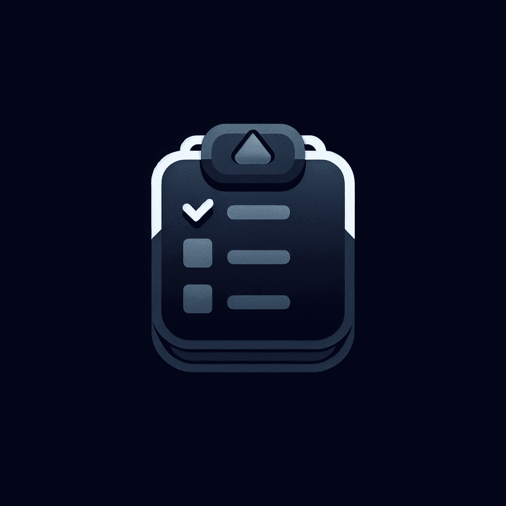
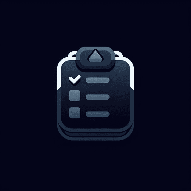
Try:"checklist icon, minimal, white and yellow, black background" -
Choose a style
Great picks for dark mode:- Minimalistic
- Neon
- 3D (with light accents)
- Modern Line Art
-
Customize colors
Pick high-contrast combos like:- Jet Black + White
- Midnight Blue + Yellow
- Charcoal + Neon Green
-
Preview on light and dark
Make sure your icon looks just as good in both themes.
💡 Pro Tips
- Add a thin glow or outline to help light icons pop on dark backgrounds.
- Keep backgrounds simple—avoid gradients that could clash.
- Use bold shapes and flat design for better clarity at small sizes.
Final Thought: Don’t Let Your Icon Fade to Black
Your app icon should stand out no matter what theme your user prefers.
With dark mode usage on the rise, designing for it isn’t optional—it’s essential. Try out different color and style combos with our AI Icon Generator, and get a dark-mode-ready icon in minutes.

Start Creating your own Icons
- AI Icon Generator
- Many styles to choose from (Modern, Polygonal, etc)
- Choose the color of your Icon (Pure White, Jet Black)